By Krista Bowen
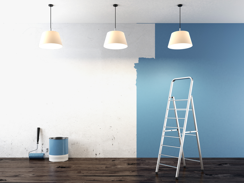
With the new year just around the corner, you may be itching to make some home improvements. Picking a new color scheme is a great way to update the look of your home, but it can be easy to become overwhelmed if you don’t know where to begin.
Start small
Avoid the beginner’s panic that comes from finding colors for all the rooms at once and start with one room. Just one. There is no sure rule about what room it should be, so pick a room that inspires you.
It could be the biggest, most centrally located room like the living room or kitchen. Or you could pick a room that you want to paint the boldest color. Whatever room you choose, it should get you excited about your new project.
Look at what you’re stuck with
You might want to take on a total makeover of the room, but odds are you don’t want to replace all the furniture or remodel the permanent features. The colors of cabinets or couches should be taken into consideration before you select your color scheme.
Think about how you want to feel
Color can be a powerful tool, effecting your mood and even your taste. Choosing the wrong color can influence people to feel irritable, but the right color can encourage communication or creativity.
Color psychology is the study of how color impacts your emotions and behavior. Here are quick tips to get you started.
Bright colors: Bright shades of yellow, green, orange or blue can encourage conversation and happiness.
![]()
- How to use: Use vibrant colors in your living room or kitchen to create a welcoming atmosphere.
- What to avoid: Don’t overpower your rooms with these colors. Make sure to balance out with neutral colors. A small amount of bright shades goes a long way in any room.
Dark colors: Using reds, purples and dark shade of green and blue tend to have a mood dampening effect.
![]()
- How to use: Use as an accent color in a room with good lighting, like a red vase or dark green couch. The contrast of dark colors in a light room can convey security and groundedness.
- What to avoid: Using too many dark shades can leave a gloomy feeling, and reds can cause irritation. Avoid using them in a child’s room or playroom.
Warm colors: Warm hues like yellow and orange cause an increase of energy.
![]()
- How to use: Warm colors have the incredible effect of raising the perceived temperature of the room, so use them in north (why north?) facing rooms or in the basement.
- What to avoid: Because warm colors inspire activity, avoid using them in rooms where you want your brain to unwind and relax, like a bedroom.
Cool colors: Greens and icy blues have a calming effect.
![]()
- How to use: Cool shades can help you relax and get a good night’s sleep, so they are perfect for bedrooms.
- What to avoid: Navy blue has been linked to inhibiting conversation, so avoid using it in living rooms and dining rooms.
Neutrals: Neutral colors like white, gray, tan and black are essential to any color scheme, but each comes with its own strengths and weaknesses.
- White: This most basic and safe neutral can create openness in a small space and peacefulness.
- Gray: Because gray comes in so many hues it can be warm or cool and complement a room well if chosen properly. However, you should avoid using it in the kitchen and dining area, because it has been linked with a loss of appetite.
- Tan: Generally considered a warm color, it acts in a similar, but less potent way as yellows and oranges. However, darker tan? hues can make a room feel stuffy.
- Black: A bold neutral, black should be used sparingly as it acts as a cool and obviously dark color. Patterns using black, like chevron or checkered, are linked with high brain development in babies.
Get out your color wheel
Yes, those things your art teacher had you make in school can be very useful when selecting a set of colors. Color wheels organize colors to show how colors can be used together in different color schemes, which come in handy when selecting a color pallet for your home. Some common color schemes are:
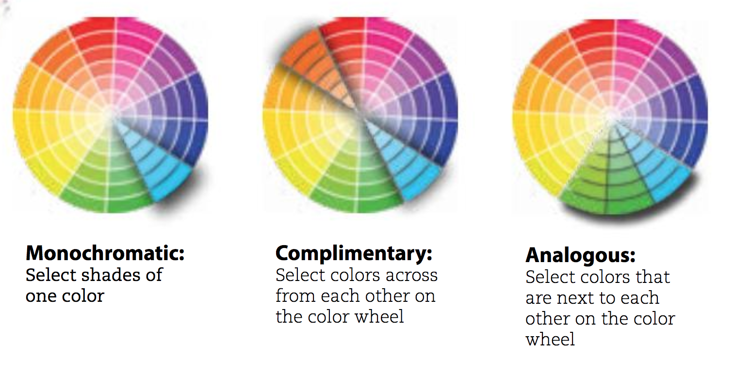
Monochromatic: Select shades of one color
Complimentary: Select colors across from each other on the color wheel
Analogous: Select colors that are next to each other on the color wheel
Take 5
No, we don’t mean take a break. An easy way to pick a color scheme is to find a color palette of five colors. These five colors will balance out the room and create the feeling you’re looking for.
- White: This is for baseboards, moldings, doors and windows for your whole house. Not all whites are the same – some have sheen and some are matte – so decide before you start.
- Neutral: It can be gray, tan or a subtle shade of a color like blue or yellow that will act as a base.
- Saturated: This will be your strongest color, so make sure you love it the most.
- Color Scheme Extension: Now look back at your color wheel. If you are looking for a monochromatic color scheme, go a shade off of your saturated color. If you want a complimentary color scheme, look across the wheel from your saturated color. If you want an analogous color scheme, use a color next to your saturated color.
- Accent: This color may or may not have a strong presence in your room, but it will add contrast.
Some digital tools for making a palette:
- Adobe Capture (app)
- colourlovers.com (website)
- Coolors.com (website and app)
- Paletton.com (website)
Try it out
Once you’ve selected a color scheme don’t immediately go out and buy all the paint you need for the entire room. Test your colors by buying sample sizes and painting swatches onto your walls. For best results, paint large swatches in the light and dark corners of the room to see how the light effects the color throughout the day. Remember, light changes everything.
Go from there
Once you’ve settled on the colors for the first room, move out from there by following the steps above. Any space you can see from the room you started in needs to work with the original color scheme to avoid clashing. Find color schemes that tie the space together.
If you don’t want the adjacent rooms to be too matchy, take your saturated color and pull out your color wheel again. If you chose a complementary scheme for your main room, perhaps try an analogous or a monochromatic scheme. For a more bold transition, you could use the saturated color as the accent color in the next room to tie them together.
Source: rd.com
What about the garage?
Use neutral tones, grays, and light colors. Garages are typically less lighted than other areas in the home, so light colors can help provide more light. Neutral colors will make it so you don’t feel a clash walking from the house into the garage. When it comes to the garage floor, durability is just as important as color.

I really like your tip about using five different shades of a color to extend the color scheme if you’re going for a monochromatic approach. My daughter is thinking of repainting her home office with a nice leathery-brown scheme to appeal to more future clients. I’d definitely share this article with her so she can ask her residential painting service to throw in a few shades of lighter and or darker brown in the room.